Today's businesses leverage data from various sources, including social media, on-premise databases, Snowflake's Data Cloud, and more, to make well-informed and data-driven decisions. However, going through a slew of individual reports might be exhausting. This is where data visualization and dashboards come in handy. Using dashboards, organizations can track key performance indicators (KPIs) and accomplish business goals.
Astrato Analytics is one of these simple-to-use data analytics tools. In this tutorial, you'll learn all about Astrato Analytics and how to create a dashboard. After you complete this article, you'll have a good understanding of:
- How to create measures in Astrato Analytics
- How to create and share dashboards in Astrato Analytics and a lot more.
What is Astrato Analytics?
Astrato Analytics is a business intelligence software that lets you analyze and visualize data from Google Sheets and cloud platforms such as Snowflake and PostgreSQL. Using this tool, you can access Snowflake's data cloud and live query data analytics anytime in the cloud and build your business dashboards with Astrato's drag and drop capabilities.
Features of Astrato Analytics
- It has functional integration with Snowflake's Data Cloud platform, Google Sheets, and PostgreSQL.
- You can get real-time data from those platforms to support the pace of business decisions.
- You can also collaborate, suggest, and get fresh perspectives for streamlined, hassle-free teamwork. More features, such as collaboration with comments, are expected in the upcoming releases.
Download the dataset
You can download the data used in this tutorial directly from Github.
- Download Onyx's data pie bakery Excel Workbook.
- Open your Google drive.
- Right-click and create a new folder.
- Open this folder and create a new Google Sheet.
- Navigate to where you saved the downloaded sample Excel workbook, and copy the data from it.
- Paste this data into the newly created Google Sheets.
How to Create a Dashboard in Astrato Analytics?
Before you begin, you will need to sign up. You can also sign up using Google or LinkedIn authentication. However, if you want to use your Google Sheets as a data source, you need to sign in using your Google account.
Once your account is created, you will be directed automatically to your workspace. Now, all you have to do is follow this step-by-step tutorial to create your first custom dashboard.
Step 1: Getting your data.
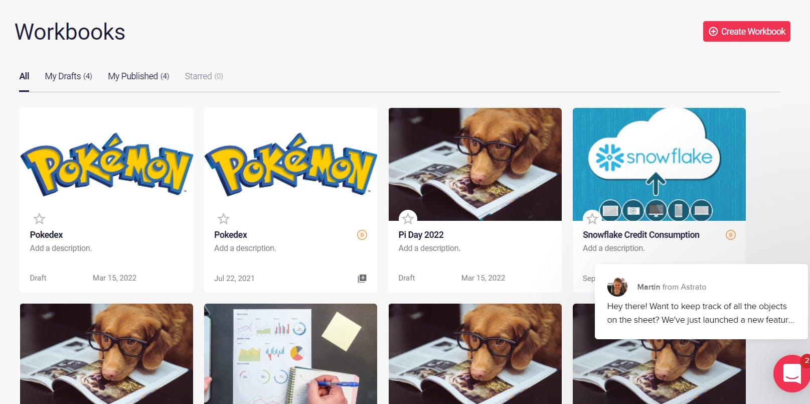
In your workspace, click on the "Create a workbook" option. Next, you will be asked to pick a data source. At the moment, this can either be a Google Sheet, Snowflake's Data Cloud platform, or PostgreSQL.
For this tutorial, you should select the Google Sheet option. Next, you will need to grant Astrato Analytics permission to read and access your Google Sheet. Finally, on the log-in screen, you'll see a request for access to a Google sheet; make sure to allow any access requests.
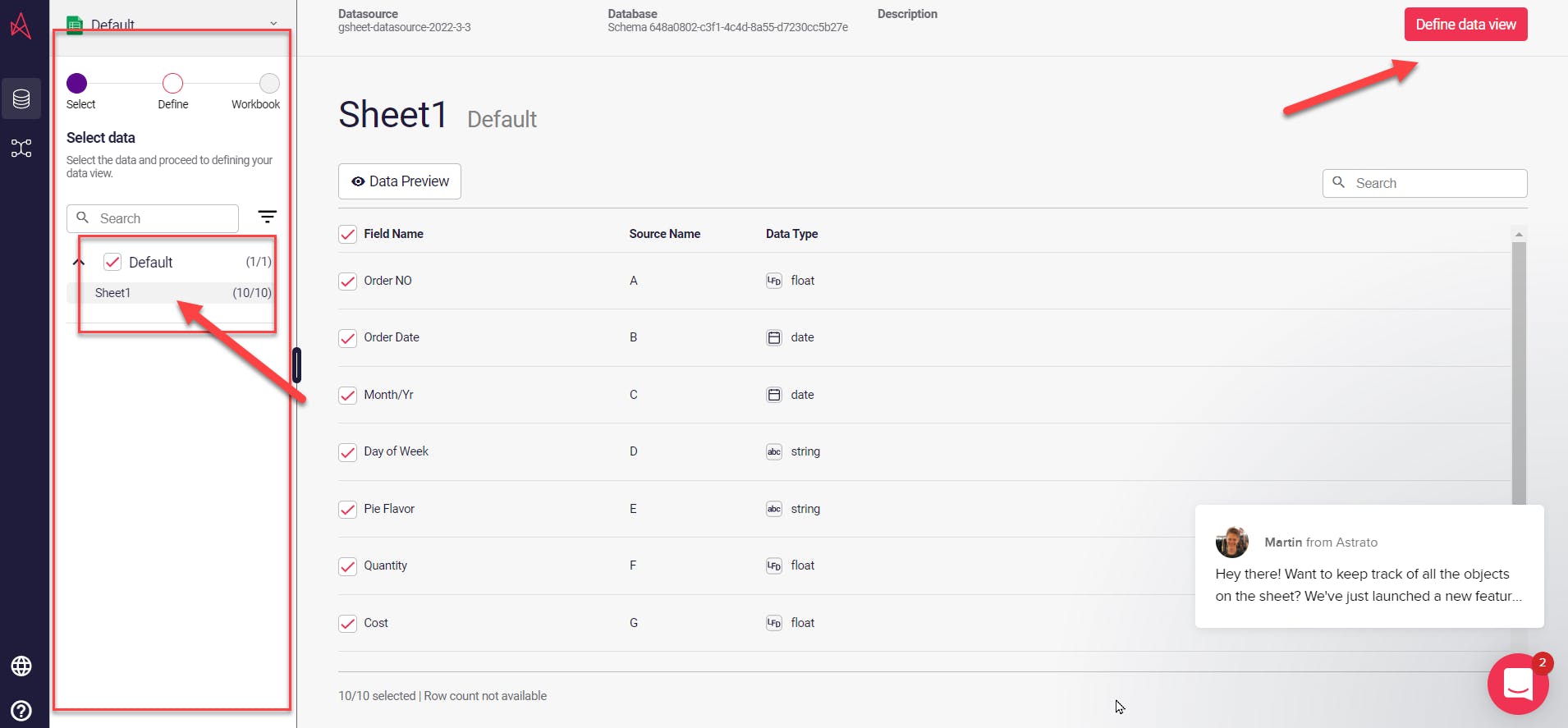
From the navigation pane on the left labeled "default," choose the sheet you would like to work on within the Google Sheet you have imported. After this, click on the "Define Data View" button located at the top right of your screen. Again, clicking on default will allow you to name the data view, which is recommended and is best practice.
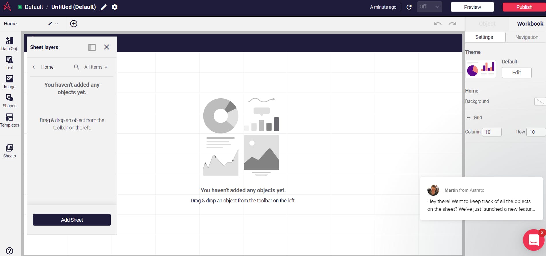
Click on "Create Workbook" since we only have one table and select a layout. Let's go for a blank sheet layout. Astrato should direct you to a visualization creation interface.
Step 2: Creating and exploring an Astrato Analytics dashboard.
Astrato Analytics offers you a wide variety of data objects and icons to represent different visualizations.
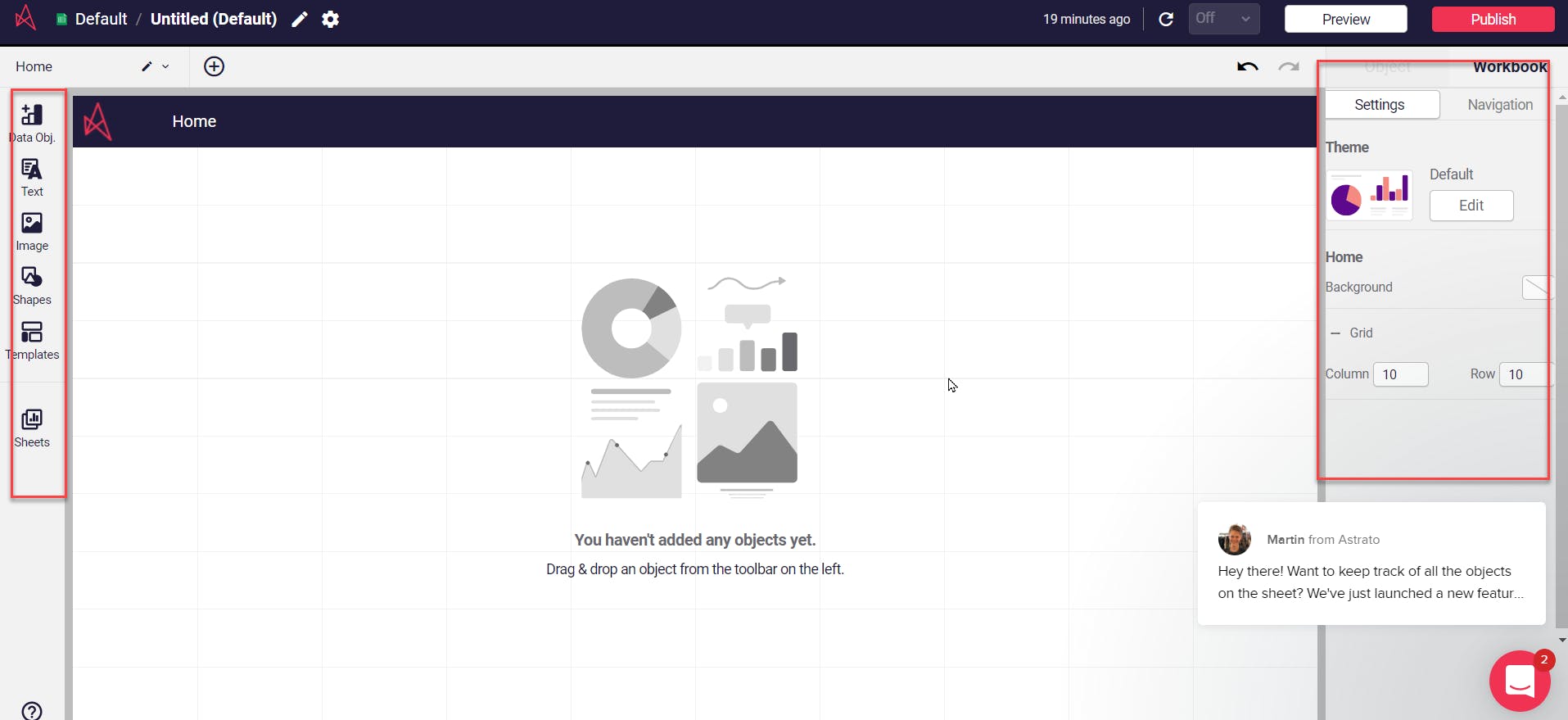
The left pane has a fields section that allows you to choose and switch between various data objects, shapes, and icons. For example, the data object has different chart types: bar charts, line charts, pie charts, tables, progress charts, scatter charts, combo charts, and heatmaps. You can also add filters, text, import images from the web, pick a template, and add a new sheet from the left pane.
For instance, let's say you want to create a pie chart that displays the percentage of in-store and pre-order transactions. From the left pane, select Data Object, then select a pie chart. Next, head over to the right pane, click on the dimension, select the variable, Pre-Order/In-Store Purchase, then click on measure and select the sum of the cost variable.
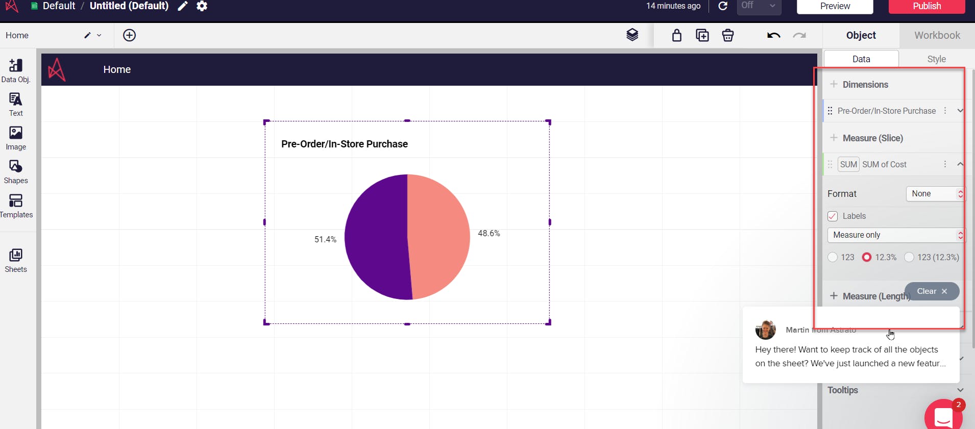
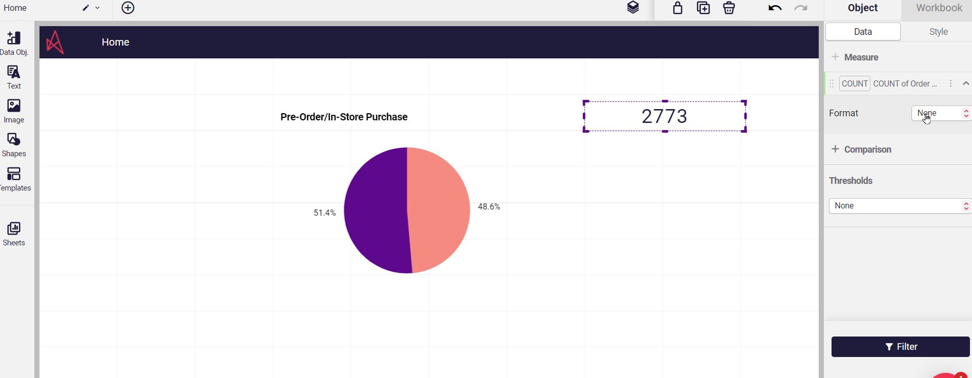
Creating visuals is as easy as picking your preferred chart type in the left pane and selecting the variable you wish to measure in the right pane. Besides charts, you can also create KPIs by picking numbers from your data objects and selecting the measure, perhaps a count of orders from the right pane.
Step 3: Publish your dashboard
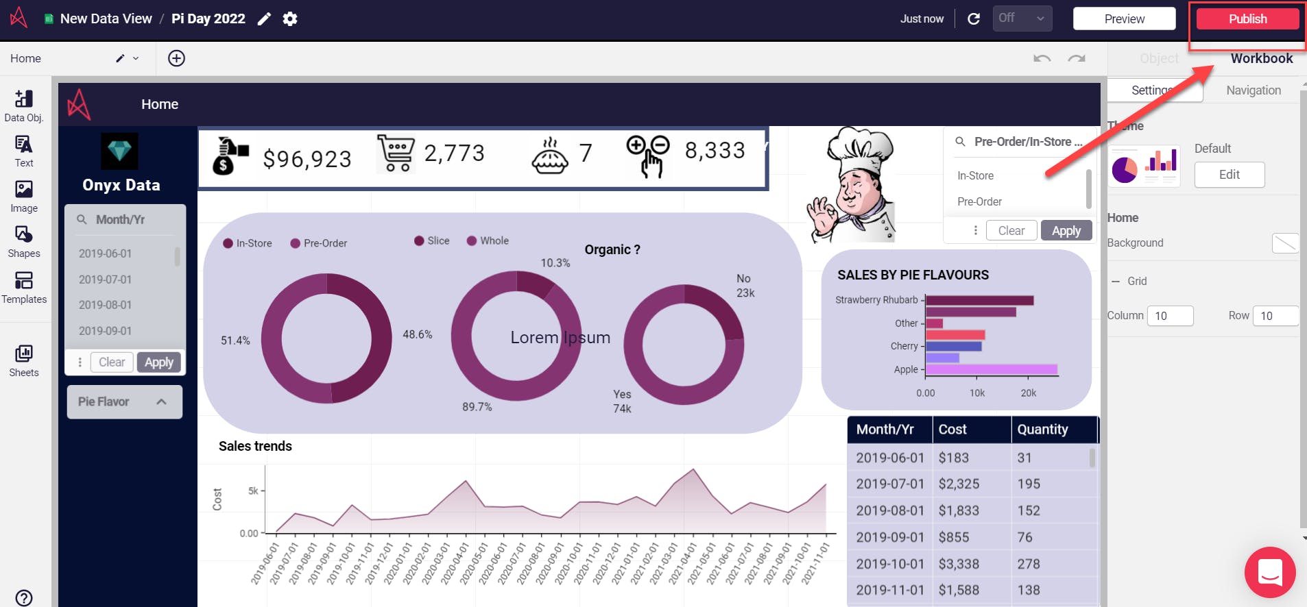
Once your dashboard is ready and populated with insightful charts, click on the "publish" button on the top right of your toolbar.
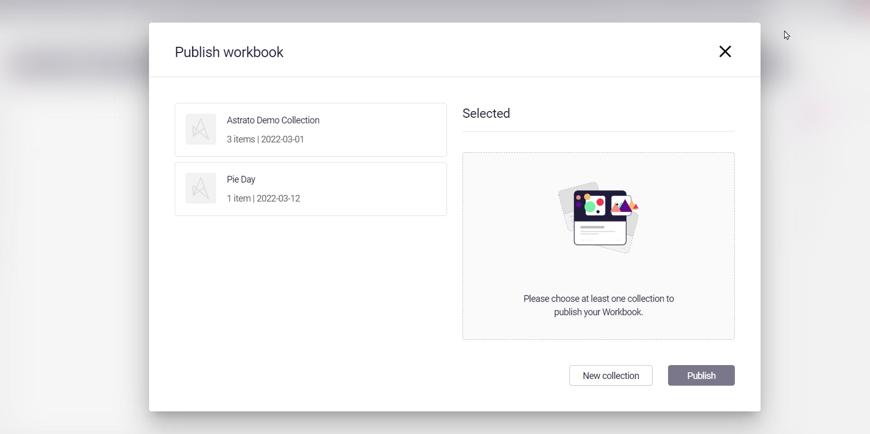
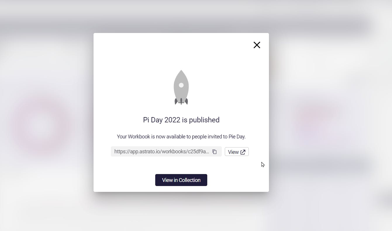
You can publish it as a new collection or an already existing collection. In addition, a sharing link is also generated. This link allows you to share your dashboard with the colleagues you have invited into your workspace.
In the upcoming releases, Astrato Analytics plans on introducing embedding features for public sharing. Right-click on a published sheet and select embed sheet, group, or object from the pop-up menu to use embeddable links. However, the embed links only function with Snowflake data at the moment.
Wrapping up!
Astrato Analytics is a pretty easy-to-use and good analytic tool that will significantly impact your day-to-day data analysis and business operations. If you’re interested in learning more about Astrato Analytics, there are some great learning introductory resources and an Astrato essentials course on theVizlab.com to help you get started.
Thank you for reading, and if you see any incomplete information or have a question, please reach out to me on Twitter.
